Product
Vital Signsoftware Redesign
My Role
UX Designer at Worrell
Timeframe
2019 (4 months)
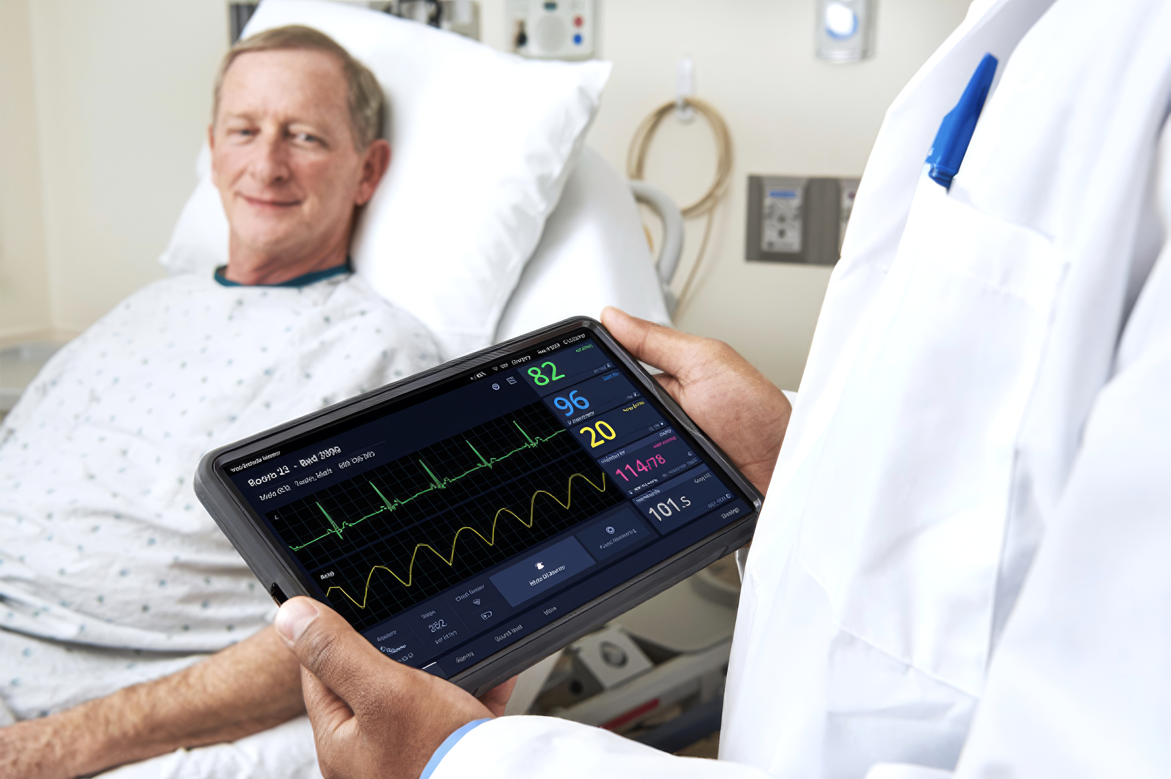
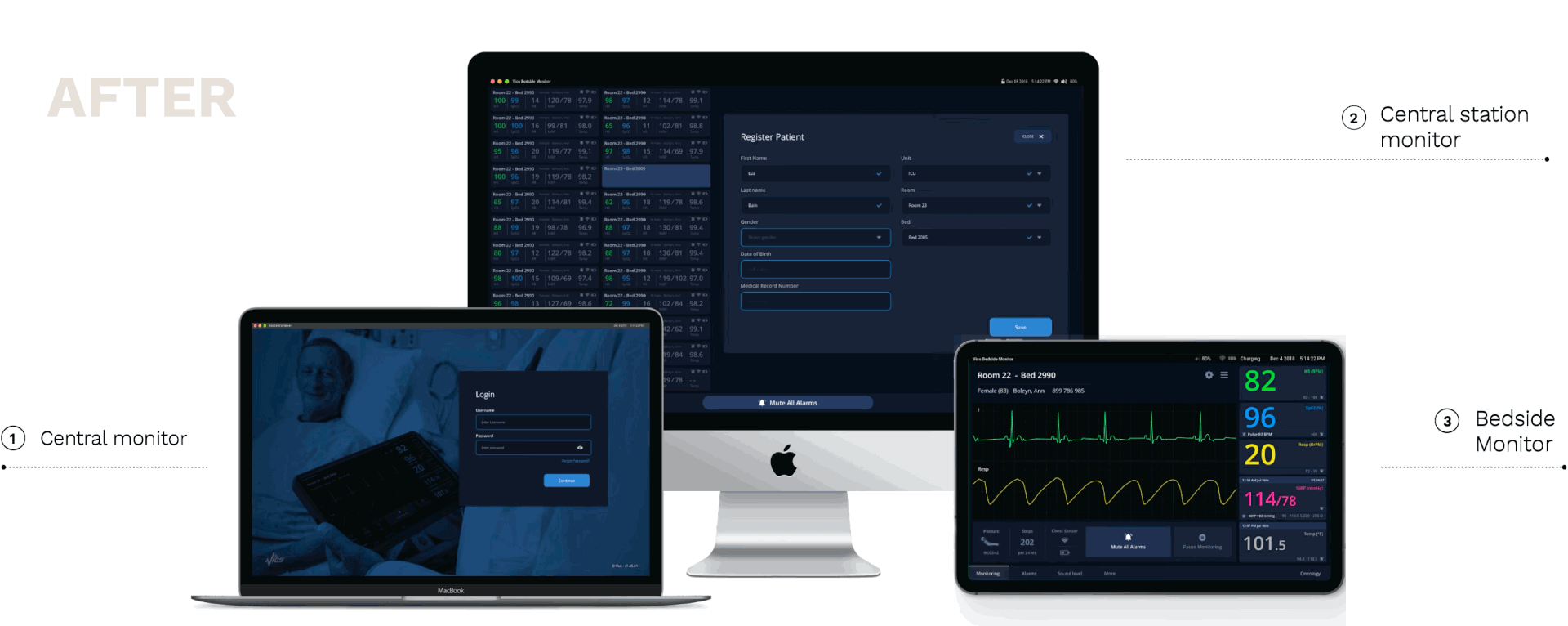
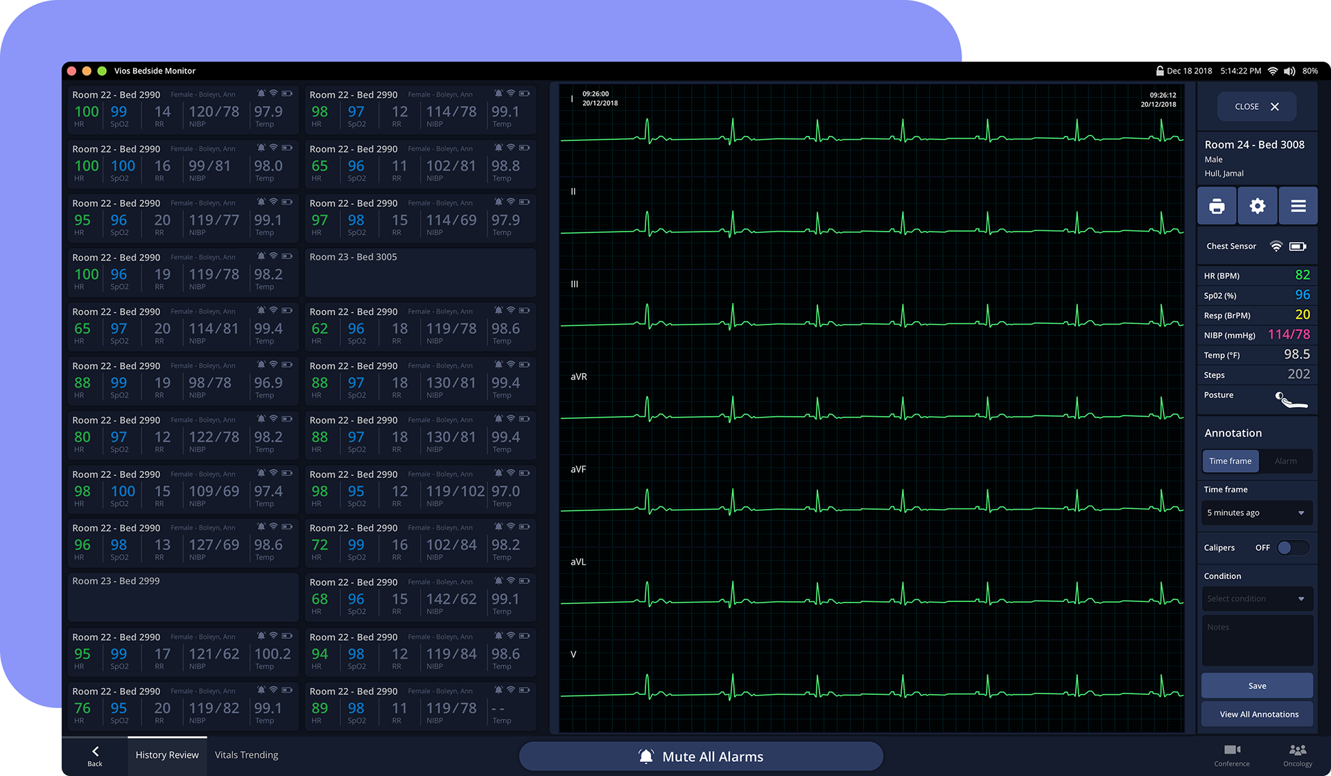
The Vios Monitoring System is used in hospitals to continuously monitor patients across three products: Bedside Monitor (BSM) – tablet for patient-side monitoring, Central Station Monitor (CSM) – web app for multiple patients, Central Server – hospital-wide data management
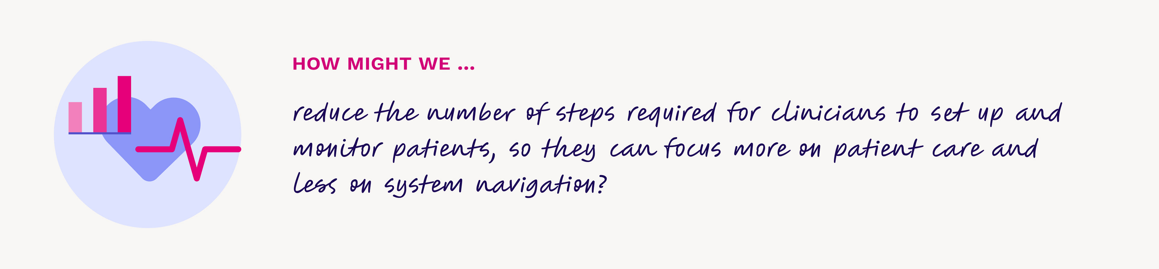
The original software was inconsistent, inefficient, and cluttered, which created risks in high-stakes clinical workflows.
A System that needed clarity
I led the redesign of the three Vios Monitor software products to establish a cohesive UX foundation—simplifying interactions, enhancing readability, and creating a calm, reliable bedside monitoring experience.
Clarity under pressure
The Vios Monitoring System originally consisted of three separate products that lacked a unified structure and visual language. Clinical staff often described the experience as fragmented, making fast navigation difficult during time-critical situations.
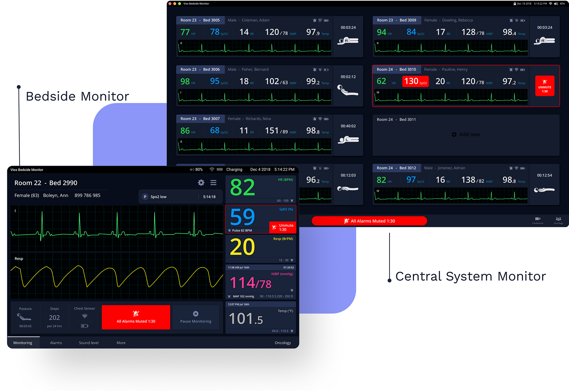
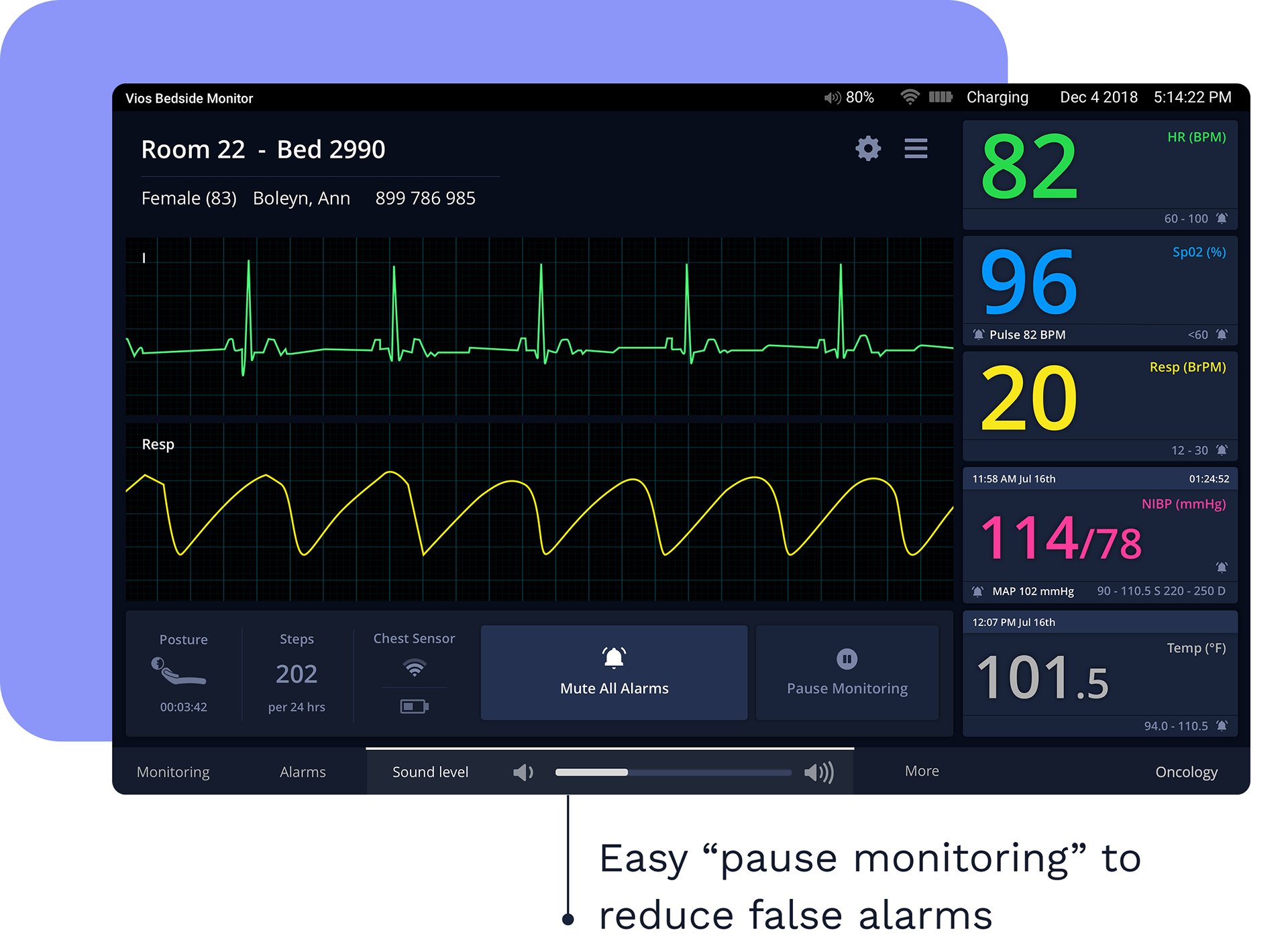
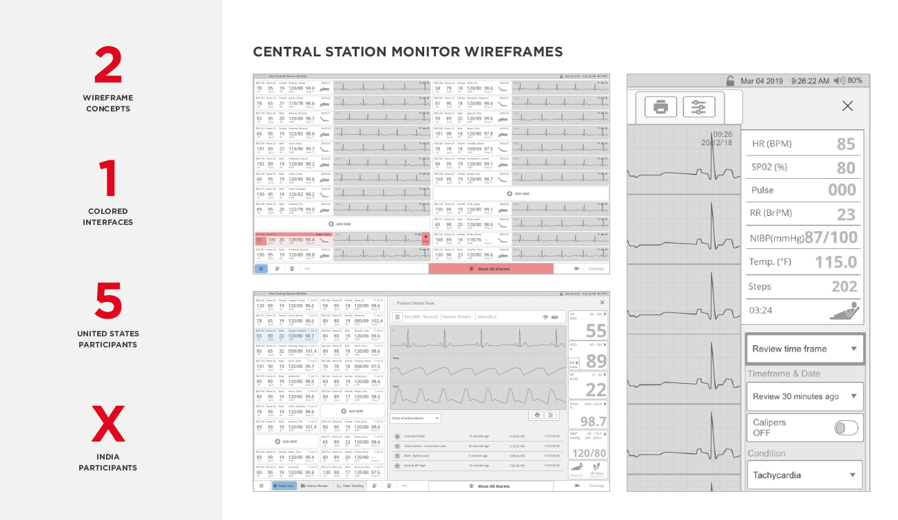
Easy to interpret alarm
Alarms highlight the exact vital sign causing the issue, with visibility from over four meters away so clinicians can react quickly and confidently.
Reduced Cognitive Load
By minimizing clicks, introducing smart pre-populated fields, and adding a clear “Pause Monitoring” option, the new design helped clinicians work faster with fewer distractions and fewer false alarms.
Reimagining the Experience
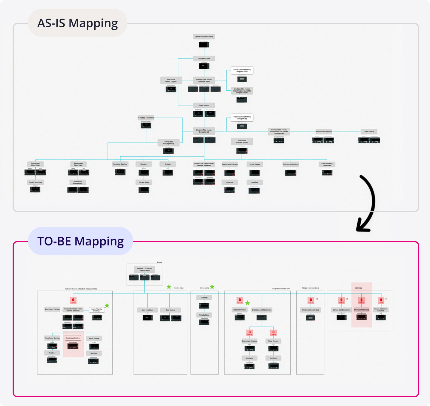
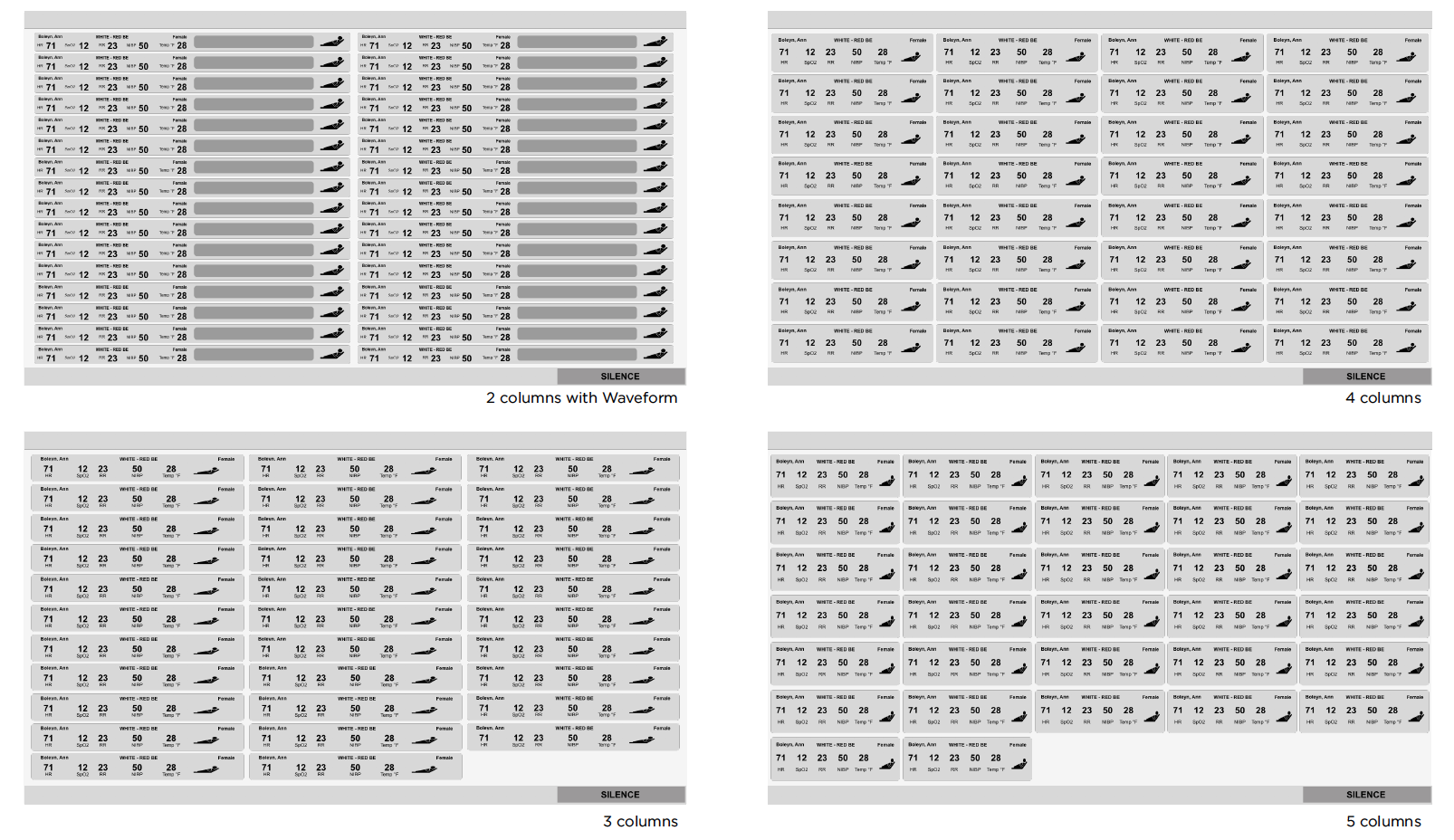
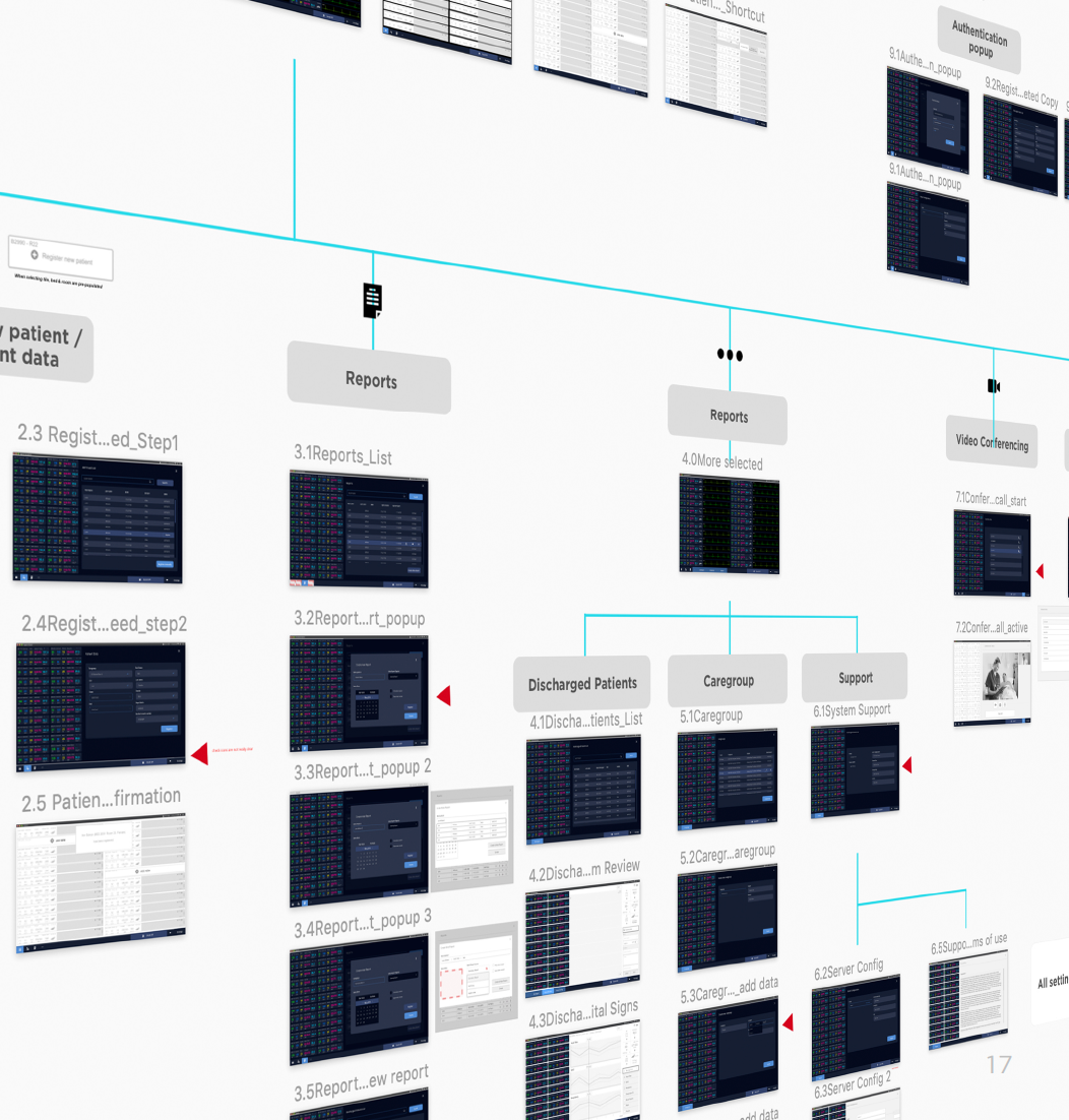
Information architecture redesign
The redesign began with restructuring the information architecture to remove friction and simplify decision-making. Early concept directions explored how a more focused, minimal interface could reduce visual noise and improve recognition.
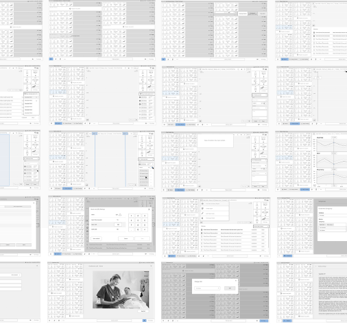
Early iterations
Through various iterations, the wireframe design of the three products was created with the help of wireframes sketches, information architecture redesign and two aesthetic concept proposals.

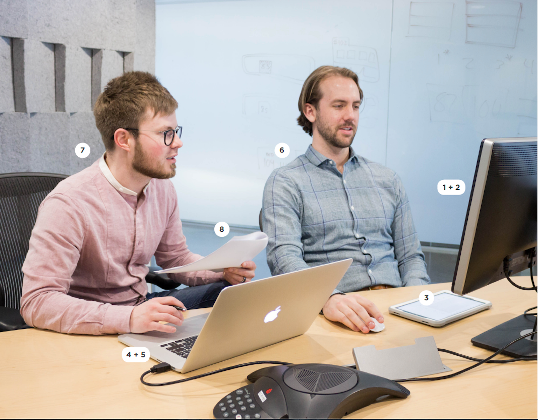
Validating the design through testing
With a semi-functional prototype, we tested key workflows with nurses in Minneapolis and India. Their feedback guided improvements to alarm visibility, tile readability, and navigation flow. We watched how quickly they recognized status changes and where hesitation still appeared.
A/B Test
To validate the impact of the redesign, we conducted A/B tests comparing the legacy interface with the new screens. When placed side by side, nurses consistently identified alarms more quickly and moved through tasks with fewer steps.

Creating a new design language
A new brand foundation was developed, including a cohesive visual language, refined typography, a neutral‑based color system, and a custom icon set aligned with FDA readability standards.